Stats on men and women in America:
http://www.businessinsider.com/map-the-states-with-more-men-than-women-2013-12?IR=T
http://data.worldbank.org/indicator/SP.POP.TOTL.FE.ZS
State by state gender population:
World population based on gender:
In 2014 50.8% of the USA population was female, leaving 49.2% of the population male.
The reason I chose the subject of male and female population across the US was because I discovered that there was a larger male population world wide than female with 50.4% being male and 49.6% female. Knowing this information I was curious to how this related to the USA. Surveys show that 50.8% of the USA is populated by females and 49.2% male. Knowing this I wanted to find out how females and males were distributed across America, whether they is a balance of gender or rather more collected areas of gender population. To create my infograph I had to find out the individual gender population for each US state. I then used various shades of blue and red to show the gender population thought out the USA, (Red- Female, Blue- Male).

My infographs that shows the population of genders throughout the USA.
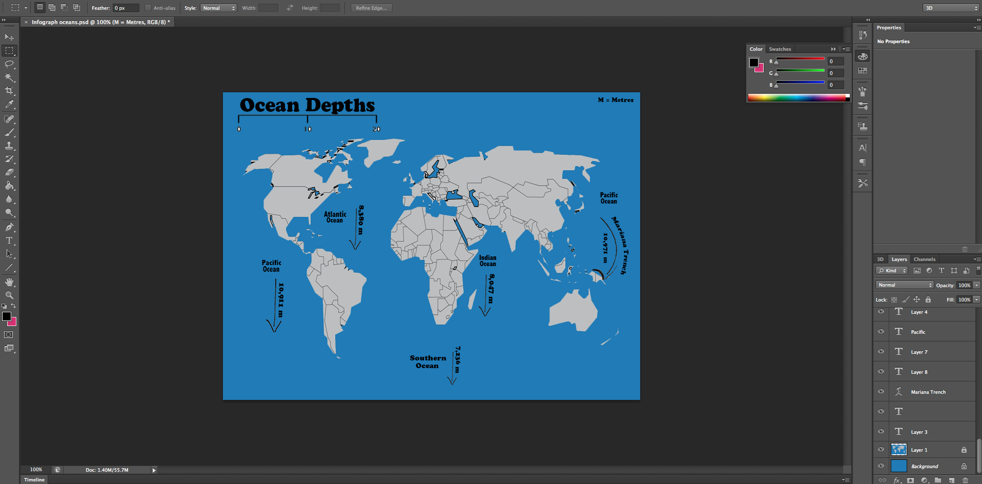
I also made an infographic that displayed the depths of the oceans across Earth. For this I studied each of the depths of the Oceans. I used different height arrows to represent the depth and used numbers to show the exact depth. The reason I wanted to show ocean depths was because geography and the ocean interest me. I learnt something for myself creating it and hopefully that resinates to the audience and they learn something new.
This website is the site I used to gather the stats related to ocean depth.
http://www.enchantedlearning.com/subjects/ocean/

My infographic created to show the ocean depths around the world. Different size arrows show the variation in depths.
Design Process:

I started off by inserting a world map into photoshop by dragging and dropping it in from google images.

I then added text using the text box tool.

I then added the numbers using the text box tool.
I then added the arrows, dragging and dropping them from google images.

I added text using the text box tool selected from the tool bar. The cursor is shown over the text tool.
Final image:

I draged and dropped in a USA map. I then used the palet tool to fill in the different colours to represent the population.

the cursor shows the palet tool used to fill in various colours.

I then ragged and dropped in an graphic of a male and female and filled them wit colour using the tool shown below.

The cursor shows the tool I used to fill in colours.
Evaluation:
If I was to create an infograph representing the population of men and women in the USA again I would create a infographic thats more easy to navigate and understand. The reason I think it is currently difficult to understand is due to the amount of colours and the different shades of colour make it hard to identify where the most populated and unpopulated places are. To avoid this in future I would overlay stats on top of the states to represent the number of men and women that reside there. I would also ensure that the colour palet has noticeable differences so you can identify what the message of the infographic is.
If I was to create the infographic of ocean depths again I would be more creative with my approach as it currently looks a but flat and basic. I would use a wave shape to represent the depth of the oceans, id also use a more clear example of the world map that doesn’t show individual countries within the continents as they are distracting to the final piece. I could also include some fact about each ocean such as the land mass they cover.
